Asbury Festhalle & Biergarten
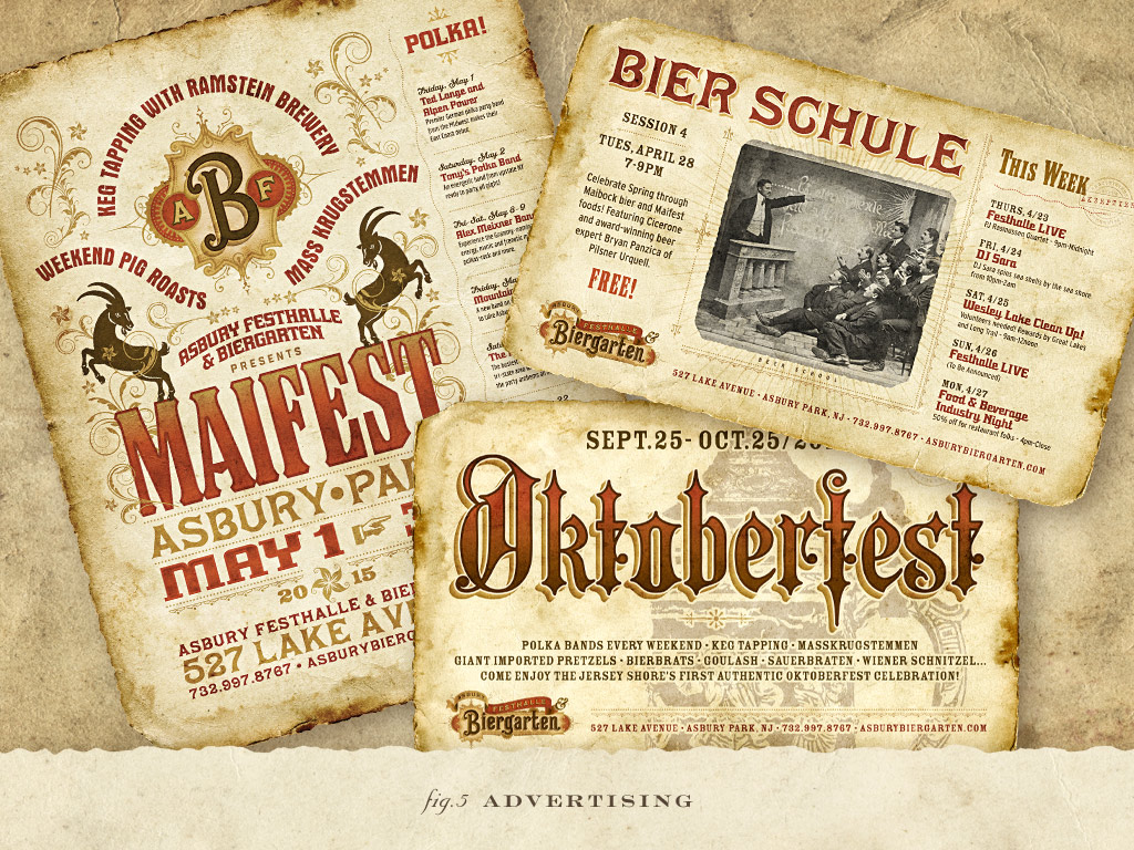
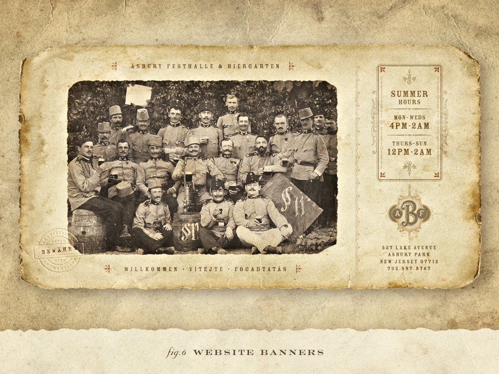
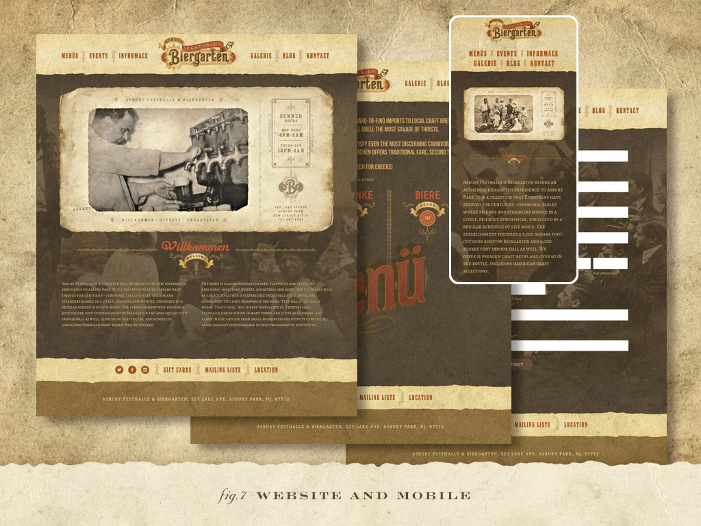
Over the years, I’ve worked on branding and visual story telling projects for clients in many industries; from healthcare, business, technology, sports, food and beverage, games and entertainment, and publishing. My work frequently crosses back and forth between design and illustration. A multidisciplinary approach has always been the key to my practice, and if asked what I do, the best answer I can give is ‘brand expressionist’. I never felt ‘graphic designer’ or ‘illustrator’ or even ‘creative director’ adequately describes what I do. I wear all these hats on projects.
I find the best clients are the ones with high expectations. The ones who have the equal attention to detail in their business model and its presentation tend to be the ones who get the best results and understand just how important their visual image is. No matter what anyone says, visual identity is the customer’s first impression. And you can only make one of those. The restaurant business is one of my favorite industries to work in, because I love restaurant culture, and because this is where first impressions are key.
So when I was approached by the owners of Pilsener Haus & Biergarten in Hoboken NJ to help brand a new Biergarten in Asbury Park NJ, I was thrilled to jump on board knowing how authentic they intended to be right down to the square inch of decor. These guys wanted the real thing, a brand identity which spoke of early 20th Century Eastern Europe combined with the Victorian seaside flare of historic Asbury Park.
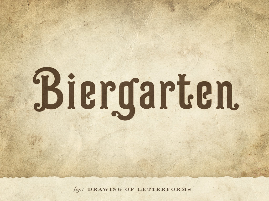
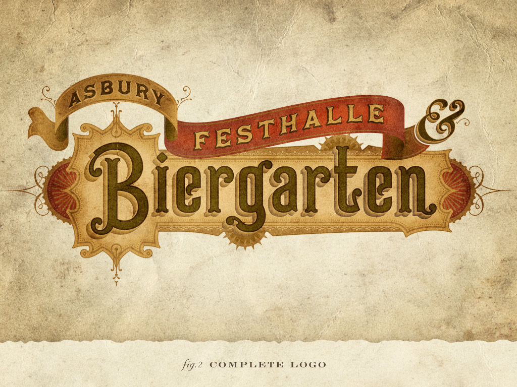
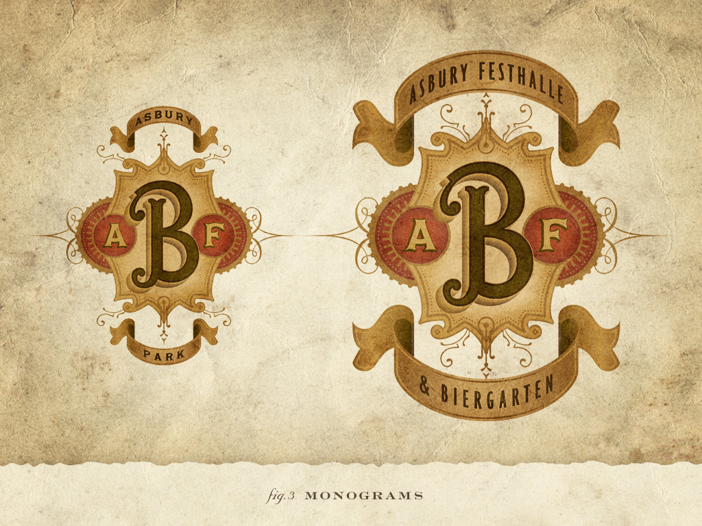
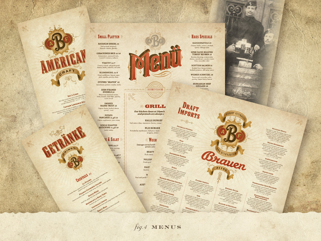
After the appropriate discovery, analysis, and meetings with the owners, partners and chef, I distilled the notes into the logo design. This is the process I call ‘brand expression”. My years designing typographic solutions would be put to the test with custom vintage lettering, a change of pace from many of the projects I do that require a more contemporary approach. ‘Biergarten’ is hand-lettered and the overall look and feel of the logo is based on the marriage of the two historic genres. Once the logo was finalized, it informed all the remaining brand components and visual assets as the ID was spread through the menus, website, advertising, in-house marketing, etc.
Of course form should always follow function and designing the campaign for print was a perfect fit. One of the main challenges was squeezing an authentic visual experience into a modern online and mobile user experience due to the high amount of graphics in an otherwise fast-loading bandwidth. We needed to keep a rich visual experience across all media.
Even though my focus is on the brand design, brand culture and experience is just as important as the restaurant’s visual ID. Once in the door, customers experience great food, craft and unique beers from around the world, attentive service, all in an authentic communal environment. Together it all makes a successful package. And if the best test for brand success is ROI and customer response, then the brand campaign is a great success because as they say, 'they’re killing it'!
Brief
Design a complete branding and marketing system for an authentic Eastern-European-biergarten-meets Victorian-resort-town in Asbury Park, NJ
